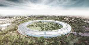
 I find these two images fascinating. They are each a rendering of the proposed new headquarters for very large tech companies: Apple and Google. Is there any doubt in your mind which is which? One is more colorful, and one more clean. One looks improvised or experimental and one is refined or unapologetic.
The branding of these images is to me, a clear example of what good architects will create for their clients. While design itself embodies values and ideals so does it’s presentation. The rendering of the Apple HQ is ultra-realistic and the building has an almost god-like aura. The effect makes you feel as though the Apple Company is an institution that will last forever.
 On the other hand, the Google rendering looks hand-rendered and is playful and colorful. This style suggests a design that is in flux and a company that is constantly evolving. The designs themselves support the rendering styles. One is pure and unbroken while the other is fragmented and serendipitous.
I have a bias for the experimental over the refined myself, and that shows in my own renderings, which tend to include a hand-rendered quality and are less often photo-realistic. This varies of course, with each client.